Seven Icons I Misinterpret
Also, while I am posting silly short things, I have recently been making a collection of Icons I Always Misinterpret Amusingly, so here, for your pleasure, is the first batch. :)
(If one of these is yours, please understand, I am not trying to criticize your taste in icons! I am just trying to evilly put these images into your heads too, okay. ...also an object lesson in making good use of your icon description fields.)
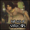 -
- ![[personal profile]](https://www.dreamwidth.org/img/silk/identity/user.png) havocthecat uses this as default, and I see it a lot on network and femmslash discussions. I presume from style that the base is a pre-Raphaelite painting, and it's described as the Lady of Shalott. Said Lady is crouched over, just barely fitting in the icon frame, with her hands sort of pulled back along her sides. She has a kind of dark and disgruntled expression, with the caption "Half Sick of Shadows," and it really looks like she's holding something sharp and pointy in her right hand. I'm pretty sure it's just an illusion, since it's Shalott and not MacBeth, but still, every time I see this icon, my first thought is "somebody's gonna get stabbed."
havocthecat uses this as default, and I see it a lot on network and femmslash discussions. I presume from style that the base is a pre-Raphaelite painting, and it's described as the Lady of Shalott. Said Lady is crouched over, just barely fitting in the icon frame, with her hands sort of pulled back along her sides. She has a kind of dark and disgruntled expression, with the caption "Half Sick of Shadows," and it really looks like she's holding something sharp and pointy in her right hand. I'm pretty sure it's just an illusion, since it's Shalott and not MacBeth, but still, every time I see this icon, my first thought is "somebody's gonna get stabbed."
 - This is kerri's default, but I think there's at least one other person in fandom using a very similar base, so it must be from something fannish? I don't know who it really is, but for some reason (maybe the color palette?) in my head it's an adolescent Luke Skywalker sulking in a back corridor of Tosche Station. While not wearing any pants. Obviously.
 - This one is marginaliana's. It is either a normal-sized dachsund carrying a large plush penis in its mouth, or a very small dachsund carrying a very large cigarette butt, I can't decide. The description just calls it his "toy", but, well, if I had a dachsund and a plush penis, it would absolutely end up as a dog toy, so that doesn't really solve anything.
 - this one is simonejester's. It is a tiny cute toy robot attempting (and failing due to scale issues) to use an Xbox controller. However, Xbox controllers just aren't a major part of my personal iconography, and I always see it as either a tiny robot fry cook at a stove or a tiny robot DJ spinning tunes (mostly depending on how hungry I am.)
 - snowynight is a another person I see around a lot but don't have friended. The given description of this icon is "an Asian doctor who's also Captain America" but for some reason, I see the shape in the background as the bottom half of a Star Trek logo, so to me it will always be an Asian doctor who's also Captain America who really wants to join Starfleet.
 - starfish uses this one often, and labels it "Joe Dick Bleak Face". Presumably this is Joe Dick from Hard Core Logo? I always see it as Cameron Mitchell, because I am bad at actor faces at the best of times, and since it's just a partial profile, it seems to hit Vala's "Earth has a very limited gene pool" problem straight on...
 - staranise has a glass teacup with some star anise floating in it as a default; reasonable enough. However, I frequently stare at it trying to figure out what the anise is floating in. It looks like lime Jello. Apparently it is mint tea and not actually lime Jello? It still looks like lime Jello to me.
...this list does not of course include the icons where I'm pretty sure the ambiguity is deliberate. Or the entire category of "I know what you look like in RL, and I doubt you intend that icon as an avatar anyway, but it will still always be my mental image of you", of whichsynecdochic's current default will always be the champion.
ETA: Also I strongly encourage the rest of you to share your accounts of the perils of icon interpretation! It is a fascinating subject, yes?
(If one of these is yours, please understand, I am not trying to criticize your taste in icons! I am just trying to evilly put these images into your heads too, okay. ...also an object lesson in making good use of your icon description fields.)
...this list does not of course include the icons where I'm pretty sure the ambiguity is deliberate. Or the entire category of "I know what you look like in RL, and I doubt you intend that icon as an avatar anyway, but it will still always be my mental image of you", of which
ETA: Also I strongly encourage the rest of you to share your accounts of the perils of icon interpretation! It is a fascinating subject, yes?
no subject
no subject
(Although she was picked to some extent as a personal avatar, so she doesn't quite fit the category; I am happy for people to visualize me as her! She matches my self-image in some ways even though they're not ways we normally think of as physical appearance - basically if I looked like Commander Valentine, that's what I would look like :P ...also my hair totally does that kind of thing on its own if I let it.)
no subject
(To tell the truth the reason I use it so often is that it's loaded up on LJ; as one of the few that don't express something silly or overly fannish it gets a workout on serious posts. (Also I can't deny that I think Hugh Dillon is darn good-looking.))
no subject
Really I don't know if he looks that much like Ben Browder other than the general handsome-white-actor-ness, I think maybe it's the pensive expression as much as anything? Browder's character on Stargate is genearlly an upbeat guy, but he does pensive well (and very prettily...), and there's something about the particular slant of the eyelids or something in that icon...
no subject
no subject
no subject
no subject
no subject
no subject
I am okay with icons but I was well into adulthood before I understood that the USPS logo is an eagle and not a man in a beret. I always wondered why you'd have a French guy on the U.S. Mail logo, but figured maybe he's French-Canadian or something. No, he's actually...an eagle.
no subject
no subject
no subject
no subject
The wing is the pointy bit of the beret, the eagle's white head is his popped collar....
no subject
no subject
I dunno what the current version looks like. Maybe an eagle's head or something.
no subject
no subject
However - I am still giggling at the 'robot frycook'... lol!
fun fact re me: my default icon has *never* been from the fandom my username comes from, which I just realized as I was typing this up. It's been Spike, Hugh Jackman and Hugh Laurie, but not once has it been Connor MacLeod... I may have to fix that some day. XD
no subject
...wait, Highlander II is a fandom? I thought there was never a 2nd Highlander movie, they just skipped to 3 for some reason!* I figured your lack of other Highlander references was an in-joke on that or something.
*note: I have only seen Highlander II in Spanish. With a snowed-out picture. And have never seen I or III. So I am not qualified to have opinions on it. (Also there was no fifth Highlander movie, either.)
no subject
There are 2 versions of the 2nd movie - one says all immies are from another planet, and thus are aliens that the X-Files might investigate; the other says they are from the v. distant past and were 'banished to the future' (which makes about as much sense, but WHATEVER). Personally, I rather like the 2nd movie, plot-wise, and I think old-man-Connor is adorkable.
HL:III is a horrid re-telling of HL:I and, aside from the parts w/ Mario van Peebles, the movie is dreadful. HL:IV & HL:V DO. NOT. EXIST. in my canon. CONNOR IS NOT A COWARD AND WOULD NOT HIDE FROM ANYONE! *ahem*
But, my default icon hasn't ever been from Highlander canon in general. No idea why, actually. Now I might have to keep it that way just for consistency and lolz. =)
no subject
no subject
Mine usually changes when I change the layout for my journal... which I haven't done in forever....
no subject
!!1
no subject
no subject
(Wow, that commercial was 5 years ago!)
no subject
...still looks like a penis though.
no subject
This is my favorite category of icon.
...do you imagine me as a man-eating medieval crocodile? :D :D I hear many people do.
no subject
Which is to say I imagine you as a medieval illuminator who has just drawn a picture of a man-eating crocodile, but gotten really bored on the long hot afternoon in the scriptorium, and given the crocodile your face. (presumably the feet belong to whoever it was who commissioned you to illustrate yet *another* bloody bestiary.)
no subject
no subject
no subject
no subject
no subject
no subject
no subject
I, uh, have a thing for vampires. And Hugh Grant was an RPG pup, which is why I have a ton of Hugh icons. Although, come to think of it, I'm not sure I ever *finished* any the vampire AUs for him. Huh. *ponders*
no subject
no subject
no subject
no subject
no subject
I wouldn't mind if people think of me as my main icon--though my hair has not been as long as Zlabya's since 1990, and I'm not as dark-skinned and nowhere near as slim in the waist. And My Lord Ivan Vorcatril looks *much* better than the scrawny cat in my icon.